Sampling, Nyquist, and Aliasing¶
Before you can understand what a pixel is, you need to understand the act that creates it: sampling. This chapter builds that foundation from first principles — starting with a 1D wave and ending with the moiré patterns you see in photographs of fine fabric.
11.1 The Problem: The World Is Continuous, Sensors Are Not¶
A scene in front of a camera emits or reflects light continuously — there is a brightness value at every real-valued point in space. A sensor cannot capture this. It can only measure brightness at a finite grid of locations. The act of choosing those locations, and measuring only there, is called sampling.
The same idea applies in time: a microphone samples air pressure at discrete moments. A camera samples scene brightness at discrete spatial positions. In both cases, the continuous world is approximated by a finite sequence of numbers.
The central question of this chapter: how many samples do you need, and what goes wrong if you take too few?
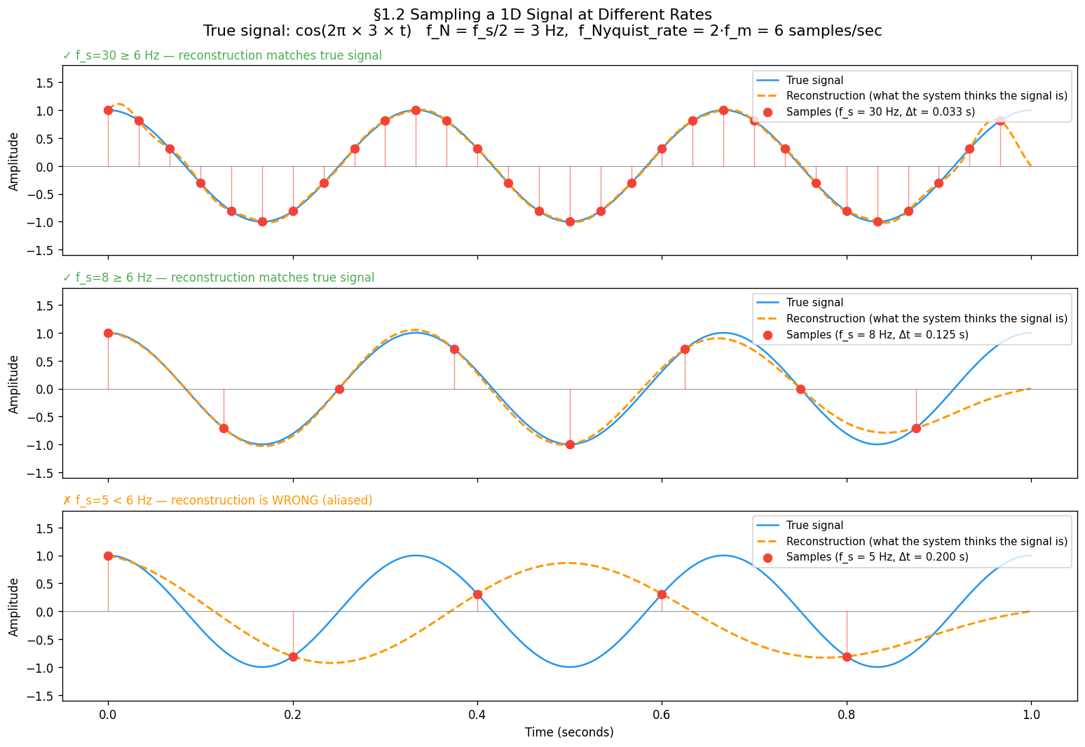
21.2 Sampling a 1D Signal¶
Start with the simplest possible case: a cosine wave at frequency Hz.
Sampling at rate means measuring this at :
The gap between consecutive samples is the sampling interval .
Three regimes to build intuition:
| Sampling rate | Samples per cycle of | Result |
|---|---|---|
| Hz, Hz | 10 per cycle | Dense — wave shape clearly traced |
| Hz, Hz | ~2.7 per cycle | Sparse — shape just about captured |
| Hz, Hz | 1.7 per cycle | Below limit — reconstruction is wrong |
import numpy as np
import matplotlib.pyplot as plt

f_m = 3.0                                     # Hz — signal frequency
t_dense = np.linspace(0, 1, 2000)            # "continuous" reference
continuous_signal = np.cos(2 * np.pi * f_m * t_dense)

sampling_rates = [30, 8, 5]                   # samples/second — dense, sparse, below Nyquist

fig, axes = plt.subplots(3, 1, figsize=(13, 9), sharex=True)
for ax, fs in zip(axes, sampling_rates):
    t_samples = np.arange(0, 1, 1.0 / fs)
    samples   = np.cos(2 * np.pi * f_m * t_samples)

    ax.plot(t_dense, continuous_signal, lw=1.5, label='Continuous signal')
    for ts, sv in zip(t_samples, samples):
        ax.plot([ts, ts], [0, sv], lw=0.8, alpha=0.6)   # stems
    ax.scatter(t_samples, samples, s=50,
               label=f'Samples (f_s={fs} Hz, Δt={1/fs:.3f} s)')

    status = '✓ OK' if fs >= 2 * f_m else '✗ ALIASING'
    ax.set_title(f'f_s={fs} Hz — {status}', fontsize=10, loc='left')
    ax.set_ylabel('Amplitude')
    ax.legend(loc='upper right', fontsize=9)

axes[-1].set_xlabel('Time (seconds)')
plt.tight_layout()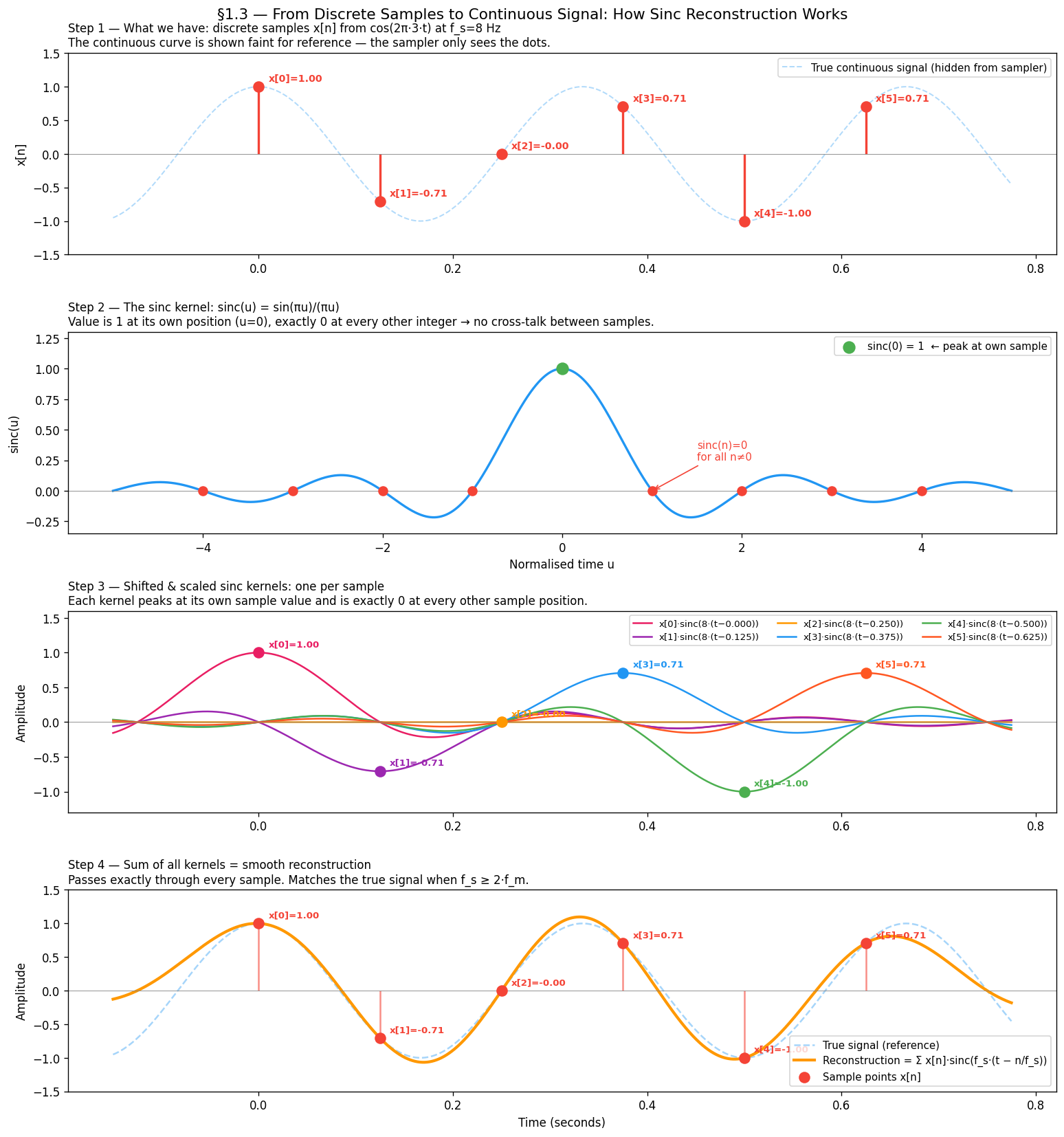
plt.show()31.3 Reconstruction — Putting the Signal Back Together¶
Sampling gives us a finite set of dots. Reconstruction is the reverse: given only those dots, recover a continuous signal. The standard method is Whittaker–Shannon sinc interpolation:
where .
Each sample contributes a sinc “bump” centred at its sample time . The bumps are designed to be exactly 1 at their own sample and 0 at every other sample — so they tile together without interfering. When you add them all up you get back a smooth continuous curve.
Why sinc? It is the ideal low-pass filter in the frequency domain — it passes all frequencies below unchanged and completely blocks everything above. This is exactly the property needed to invert sampling.
How the sinc kernel works¶
The key property of sinc is:
This means each shifted kernel is:
Equal to at its own sample time
Exactly zero at every other sample time
So the kernels tile together without interfering — each sample “owns” its position and contributes nothing to its neighbours. The sum passes exactly through every sample point and interpolates smoothly between them.
import numpy as np
import matplotlib.pyplot as plt

f_m           = 3.0
fs_sinc_demo  = 8.0

# 6 real samples from cos(2π·f_m·t) at f_s=8 Hz — same signal as §1.2
sample_times  = np.arange(0, 6.0 / fs_sinc_demo, 1.0 / fs_sinc_demo)
sample_values = np.cos(2 * np.pi * f_m * sample_times)

t_display = np.linspace(-0.15, sample_times[-1] + 0.15, 3000)
t_cont    = t_display.copy()
true_cont = np.cos(2 * np.pi * f_m * t_cont)

# sinc function for panel 2 — shown in normalised time units
t_sinc_norm = np.linspace(-5, 5, 2000)
sinc_vals   = np.sinc(t_sinc_norm)   # np.sinc(x) = sin(πx)/(πx)

# One shifted, scaled kernel per sample
palette = ['#E91E63', '#9C27B0', '#FF9800', '#2196F3', '#4CAF50', '#FF5722']
colors_kernels = [palette[i % len(palette)] for i in range(len(sample_times))]

kernels        = []
reconstruction = np.zeros_like(t_display)
for tn, sn in zip(sample_times, sample_values):
    k = sn * np.sinc(fs_sinc_demo * (t_display - tn))
    kernels.append(k)
    reconstruction += k

fig, axes = plt.subplots(4, 1, figsize=(13, 14))

# Panel 1 — Stem plot: the discrete samples with true signal faint in background
axes[0].plot(t_cont, true_cont, lw=1.2, alpha=0.35, linestyle='--')
axes[0].vlines(sample_times, 0, sample_values, lw=2)
axes[0].scatter(sample_times, sample_values, s=80, zorder=5)
for i, (tn, sn) in enumerate(zip(sample_times, sample_values)):
    axes[0].annotate(f'x[{i}]={sn:.2f}', xy=(tn, sn), xytext=(tn+0.01, sn+0.08), fontsize=8.5)

# Panel 2 — The sinc function with sinc(0)=1 and zeros at integers marked
axes[1].plot(t_sinc_norm, sinc_vals, lw=2)
axes[1].scatter([0], [1], s=100, zorder=5, label='sinc(0)=1')
for n in [-4, -3, -2, -1, 1, 2, 3, 4]:
    axes[1].scatter([n], [0], s=60, zorder=5)

# Panel 3 — Shifted scaled kernels, one per sample in a different colour
for i, (tn, sn, k) in enumerate(zip(sample_times, sample_values, kernels)):
    axes[2].plot(t_display, k, lw=1.5, color=colors_kernels[i],
                 label=f'x[{i}]·sinc(8·(t−{tn:.3f}))')
    axes[2].scatter([tn], [sn], color=colors_kernels[i], s=80, zorder=5)
    axes[2].annotate(f'x[{i}]={sn:.2f}', xy=(tn, sn), xytext=(tn+0.01, sn+0.09), fontsize=8)

# Panel 4 — Sum of all kernels = reconstruction, overlaid on true signal
axes[3].plot(t_cont, true_cont, lw=1.5, alpha=0.4, linestyle='--', label='True signal')
axes[3].plot(t_display, reconstruction, lw=2.5,
             label='Reconstruction = Σ x[n]·sinc(f_s·(t − n/f_s))')
axes[3].vlines(sample_times, 0, sample_values, lw=1.5, alpha=0.6)
axes[3].scatter(sample_times, sample_values, s=80, zorder=5, label='Samples x[n]')

plt.tight_layout()
plt.show()
The truncation problem¶
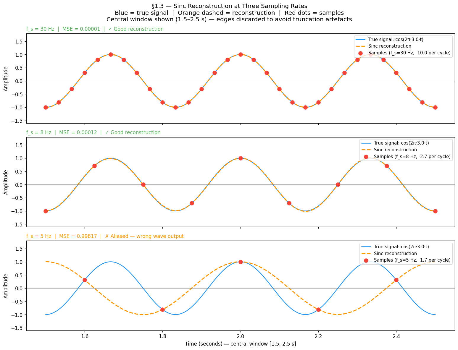
The formula sums from to — it needs samples from the entire real line. In practice we have a finite window. Cutting off the sinc tails causes edge artefacts: the reconstruction wiggles near the start and end of the window even when the sampling rate is perfectly adequate.
The fix used throughout this chapter: sample a long window (5 seconds), then evaluate reconstruction quality only in the central 1-second region. The edges are discarded. This is why the MSE curves in §1.4 are smooth rather than jagged.
import numpy as np
import matplotlib.pyplot as plt

f_m      = 3.0          # Hz — signal frequency
T_LONG   = 5.0          # long window to give sinc tails enough support
T_SHOW   = (1.5, 2.5)   # display only the central region — edges discarded

t_long  = np.linspace(0, T_LONG, 20000)
t_show  = np.linspace(T_SHOW[0], T_SHOW[1], 3000)
true_show = np.cos(2 * np.pi * f_m * t_show)

fig, axes = plt.subplots(3, 1, figsize=(13, 10), sharex=True)
fig.suptitle('§1.3 Sinc Reconstruction at Three Sampling Rates\n'
             'Orange dashed = reconstruction  |  Blue = true signal  |  Red dots = samples',
             fontsize=12)

for ax, fs in zip(axes, [30, 8, 5]):
    t_s = np.arange(0, T_LONG, 1.0 / fs)
    s_s = np.cos(2 * np.pi * f_m * t_s)

    # Sinc reconstruction — sum over ALL samples in the long window
    recon = sum(sn * np.sinc(fs * (t_show - tn)) for tn, sn in zip(t_s, s_s))

    # Samples that fall in the display window
    mask = (t_s >= T_SHOW[0]) & (t_s <= T_SHOW[1])

    ax.plot(t_show, true_show, lw=1.5, label=f'True signal: cos(2π·{f_m}·t)')
    ax.plot(t_show, recon, lw=2, linestyle='--',
            label='Sinc reconstruction')
    ax.scatter(t_s[mask], s_s[mask], s=60, zorder=5,
               label=f'Samples (f_s={fs} Hz)')

    mse = np.mean((true_show - recon) ** 2)
    status = '✓ Good reconstruction' if fs >= 2 * f_m else '✗ Wrong — aliased reconstruction'
    ax.set_title(f'f_s = {fs} Hz  |  MSE = {mse:.4f}  |  {status}', fontsize=10, loc='left')
    ax.set_ylabel('Amplitude')
    ax.legend(loc='upper right', fontsize=9)
    ax.axhline(0, color='gray', lw=0.5)
    ax.set_ylim(-1.6, 1.8)

axes[-1].set_xlabel('Time (seconds) — central window shown, edges discarded')
plt.tight_layout()
plt.show()
What to observe:
At Hz: reconstruction (dashed) overlaps the true signal almost perfectly — MSE ≈ 0
At Hz: reconstruction still tracks the true signal — just above the Nyquist rate
At Hz: reconstruction outputs the wrong wave entirely — this is aliasing
This raises the key question: what is the minimum that guarantees correct reconstruction?
41.4 The Nyquist Criterion¶
The minimum sampling rate for faithful reconstruction has an exact answer:
This is the Nyquist–Shannon sampling theorem. The minimum rate is called the Nyquist rate. Half the sampling rate, , is called the Nyquist frequency — the highest frequency your chosen can represent.
Why the factor of 2? To capture a cosine you must observe at least one peak and one trough per cycle. That takes a minimum of two samples per period. One sample per cycle is not enough — you cannot distinguish a peak from a trough.
Notation used throughout this book¶
| Symbol | Meaning |
|---|---|
| Maximum frequency present in the signal | |
| Sampling rate (samples/second or samples/pixel) | |
| Nyquist frequency — the ceiling imposed by your | |
| Nyquist rate — the minimum you need |
The no-aliasing condition: , equivalently .
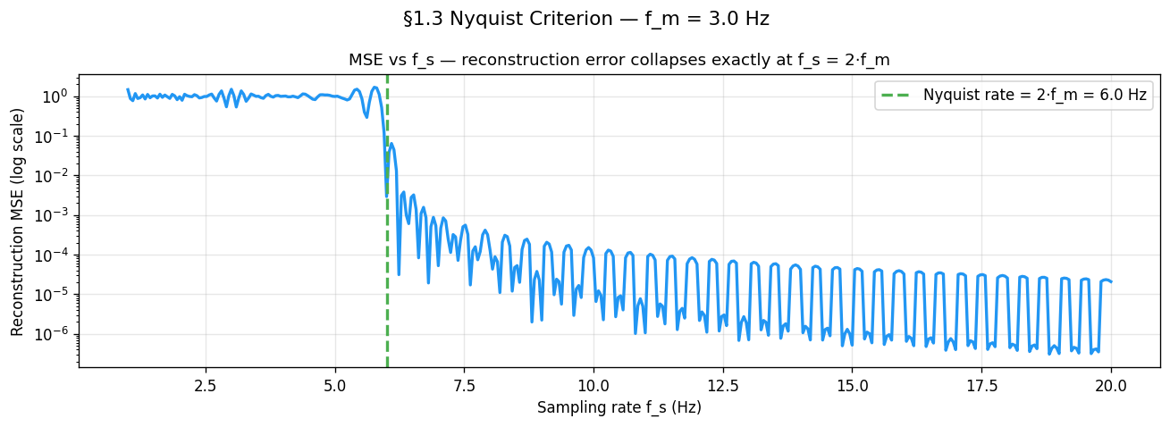
f_m = 3.0
sweep_rates = np.linspace(1.0, 20.0, 400)

# 5-second window so sinc tails have enough support.
# MSE evaluated only in central window (2–3 s) to avoid edge artefacts.
T_LONG    = 5.0
t_eval    = np.linspace(2.0, 3.0, 5000)
true_eval = np.cos(2 * np.pi * f_m * t_eval)

errors = []
for fs in sweep_rates:
    t_s   = np.arange(0, T_LONG, 1.0 / fs)
    s_s   = np.cos(2 * np.pi * f_m * t_s)
    recon = sum(sn * np.sinc(fs * (t_eval - tn)) for tn, sn in zip(t_s, s_s))
    errors.append(np.mean((true_eval - recon) ** 2))

fig, ax = plt.subplots(figsize=(11, 4))
ax.semilogy(sweep_rates, np.array(errors) + 1e-10, lw=2)
ax.axvline(2 * f_m, linestyle='--', label=f'Nyquist rate = 2·f_m = {2*f_m} Hz')
ax.set_xlabel('Sampling rate f_s (Hz)')
ax.set_ylabel('Reconstruction MSE (log scale)')
ax.set_title('MSE vs f_s — reconstruction error collapses exactly at f_s = 2·f_m')
ax.legend(); ax.grid(True, alpha=0.3)
plt.show()
Why does MSE oscillate above Nyquist?¶
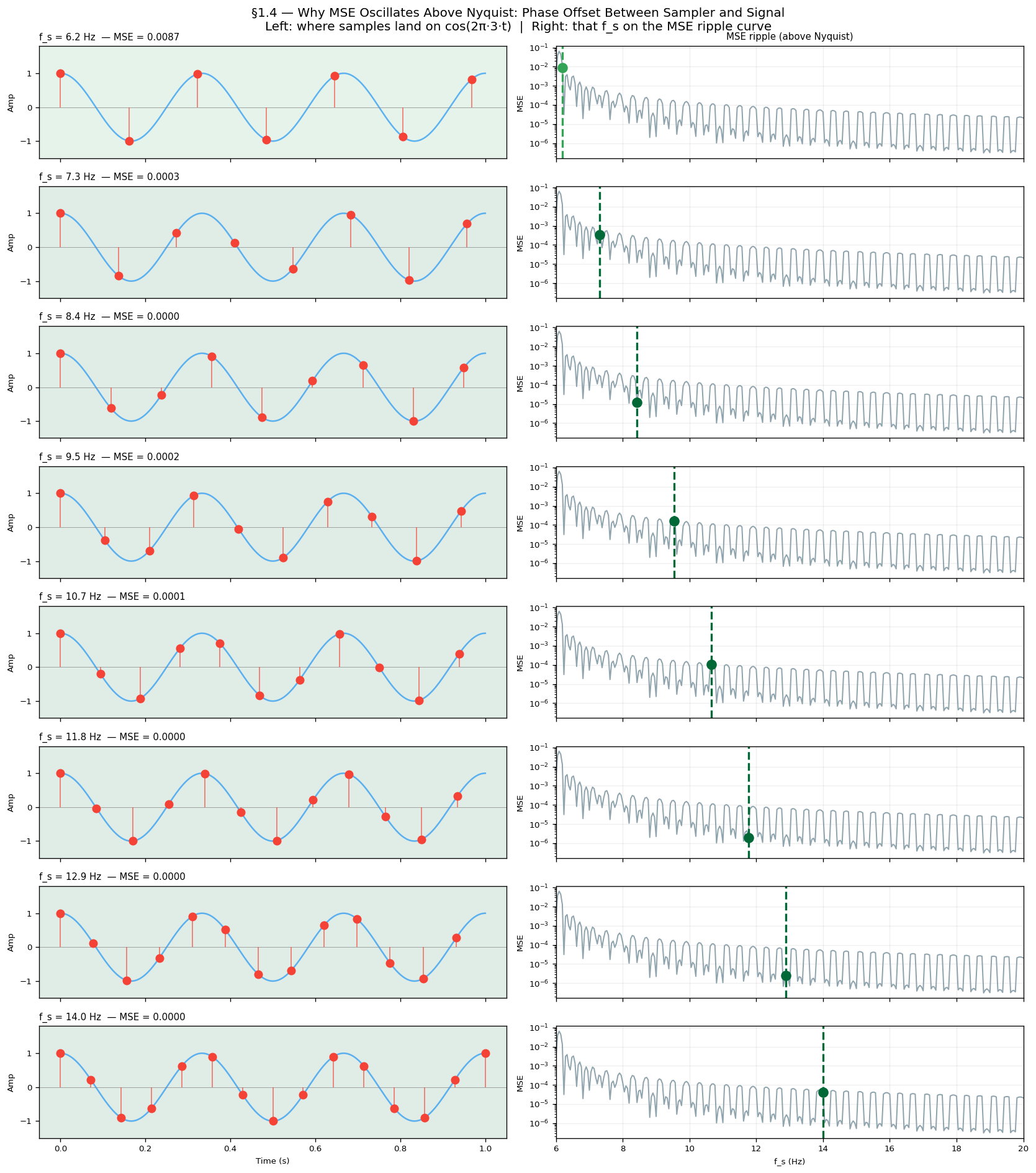
Look at the MSE curve above Nyquist. It does not fall smoothly to zero — it ripples up and down as increases. This is not noise or a simulation artefact. It is a direct consequence of phase offset between the sampler and the signal.
For each the sample grid lands on a different phase of . When samples fall near the peaks and troughs they carry maximum information and MSE is low. When they fall near the zero-crossings they carry almost none and MSE is high. As sweeps continuously this phase relationship cycles through all possibilities, producing the periodic ripple.
The figure below shows this directly: each row is a different above Nyquist. The left panel shows where samples land on the wave; the right panel marks that on the MSE ripple curve. You can see the MSE go up when samples cluster near zero-crossings and down when they hit peaks.
f_m   = 3.0
T_LONG = 5.0
t_eval = np.linspace(2.0, 3.0, 5000)
true_eval = np.cos(2 * np.pi * f_m * t_eval)

demo_rates = np.linspace(6.2, 14.0, 8)   # 8 values, all above Nyquist (2·3=6 Hz)

fig, axes = plt.subplots(len(demo_rates), 2, figsize=(14, 16))

for row, fs_demo in enumerate(demo_rates):
    t_wave = np.linspace(0, 1.0, 3000)
    axes[row, 0].plot(t_wave, np.cos(2 * np.pi * f_m * t_wave), lw=1.5, alpha=0.7)

    # Sample the long window, display only first second
    t_s = np.arange(0, T_LONG, 1.0 / fs_demo)
    s_s = np.cos(2 * np.pi * f_m * t_s)
    t_s_show = t_s[t_s <= 1.0]
    s_s_show = s_s[:len(t_s_show)]
    axes[row, 0].scatter(t_s_show, s_s_show, s=55, zorder=5)
    axes[row, 0].vlines(t_s_show, 0, s_s_show, lw=1.2, alpha=0.6)

    # MSE for this f_s
    recon = sum(sn * np.sinc(fs_demo * (t_eval - tn)) for tn, sn in zip(t_s, s_s))
    mse = np.mean((true_eval - recon) ** 2)
    axes[row, 0].set_title(f'f_s={fs_demo:.1f} Hz  MSE={mse:.4f}', fontsize=9, loc='left')

    # Right panel: MSE ripple curve with this f_s marked
    axes[row, 1].semilogy(sweep_rates[sweep_rates >= 6], errors_above_nyq + 1e-10, lw=1.2)
    axes[row, 1].axvline(fs_demo, lw=2, linestyle='--')
    axes[row, 1].scatter([fs_demo], [mse + 1e-10], s=80, zorder=5)

plt.tight_layout()
plt.show()
What to observe:
Rows where samples land near ±1 (peaks/troughs) → green background, low MSE
Rows where samples land near 0 (zero-crossings) → red background, high MSE
The right-panel ripple curve confirms the pattern: MSE dips each time samples hit peaks, rises each time they hit zero-crossings
This is the same phenomenon as §1.7 (Phase Offset) but shown continuously across all values, not just at the Nyquist boundary.
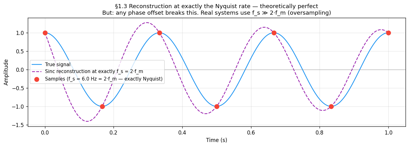
What “sufficient” really means¶
The theorem says is sufficient — in theory. The figure below shows that at exactly the Nyquist rate, sinc reconstruction recovers the signal perfectly, but only if the sample grid is perfectly phase-aligned with the signal. In practice the sampler and signal have independent clocks. Section 1.6 shows what happens when they are not aligned.
fs_nyquist = 2.0 * f_m          # exactly at Nyquist
t_s  = np.arange(0, T_LONG, 1.0 / fs_nyquist)
s_s  = np.cos(2 * np.pi * f_m * t_s)

t_ref      = np.linspace(0, 1, 5000)
true_signal = np.cos(2 * np.pi * f_m * t_ref)

# Sinc reconstruction from the long sample set, evaluated on 0–1 s
recon = sum(sn * np.sinc(fs_nyquist * (t_ref - tn)) for tn, sn in zip(t_s, s_s))

fig, ax = plt.subplots(figsize=(11, 4))
ax.plot(t_ref, true_signal, lw=1.5, label='True signal')
ax.plot(t_ref, recon, lw=1.5, linestyle='--', label='Sinc reconstruction at f_s = 2·f_m')
ax.scatter(t_s[(t_s >= 0) & (t_s <= 1)],
           np.cos(2 * np.pi * f_m * t_s[(t_s >= 0) & (t_s <= 1)]),
           s=70, zorder=5, label=f'Samples (f_s = {fs_nyquist} Hz)')
ax.set_xlabel('Time (s)'); ax.set_ylabel('Amplitude')
ax.set_title('Reconstruction at exactly Nyquist — perfect when phase-aligned\n'
             'Real systems oversample (f_s ≫ 2·f_m) to make phase offset negligible')
ax.legend(fontsize=9); ax.grid(True, alpha=0.3)
plt.show()51.5 Aliasing — High Frequencies Impersonating Low Ones¶
When , something surprising happens: the samples from the high-frequency signal are identical to the samples of a lower-frequency signal. The sampler cannot tell them apart. The high frequency does not disappear — it pretends to be a lower frequency. This phantom is called an alias.
Where does the alias formula come from?¶
Ask: which other frequencies produce the exact same sample sequence as ?
The condition is:
Cosine equality for all requires the arguments to differ by an integer multiple of :
Divide by , multiply by :
This is the complete solution set — every integer gives one more alias. The set is called the alias family of . All members produce identical discrete samples at rate .
Verification¶
Substitute and sample at :
The in cancels with in the sample spacing, leaving — always an integer — inside cosine, which is -periodic and ignores it. ∎
Consequences¶
Aliasing is irreversible — the samples carry no information about which alias family member they came from.
The effect is not distortion — the signal is not degraded, it is replaced by a different signal entirely.
Oversampling prevents it: if , all alias family members with are far above and cannot fold into the representable range.
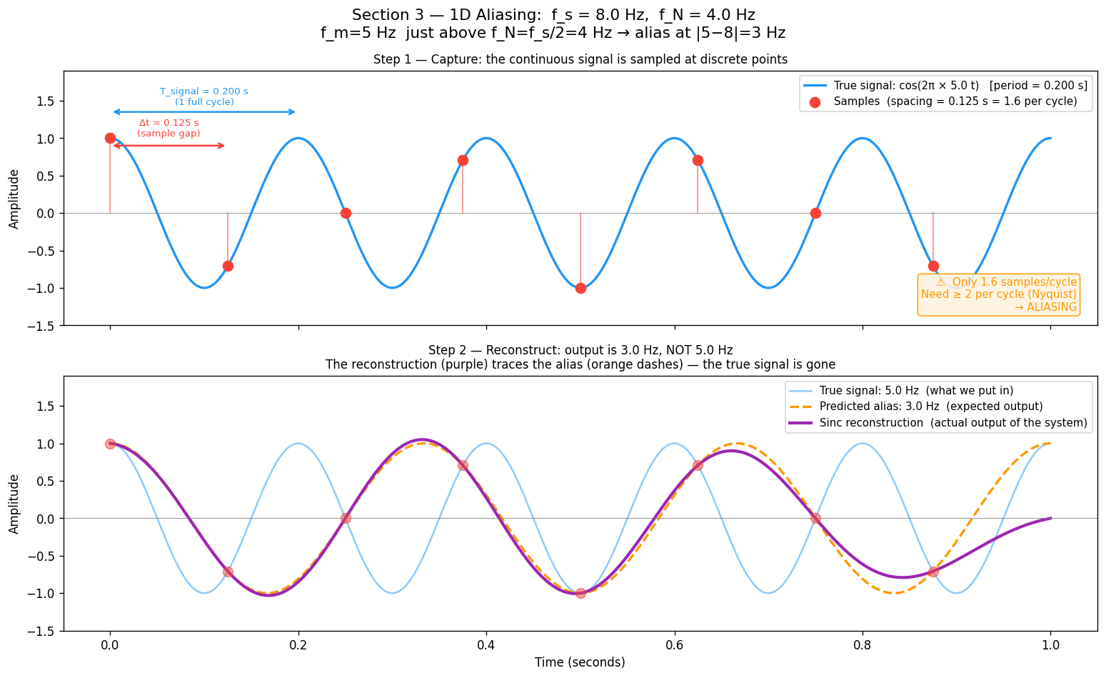
fs_demo  = 8.0          # sampling rate
f_N      = fs_demo / 2  # Nyquist frequency = 4 Hz
f_m      = 5.0          # signal frequency — just above f_N
f_alias  = 3.0          # expected alias: |5 - 8| = 3 Hz
T_SHOW   = 1.0

t_long = np.linspace(0, T_SHOW, 2000)
t_s    = np.arange(0, T_SHOW, 1.0 / fs_demo)
s_true = np.cos(2 * np.pi * f_m * t_s)

# Sinc reconstruction — outputs alias when f_m > f_N
recon = sum(sn * np.sinc(fs_demo * (t_long - tn)) for tn, sn in zip(t_s, s_true))

fig, (ax_top, ax_bot) = plt.subplots(2, 1, figsize=(13, 8), sharex=True)

# Top: true signal + sample dots
ax_top.plot(t_long, np.cos(2 * np.pi * f_m * t_long), label=f'True signal: {f_m} Hz')
ax_top.scatter(t_s, s_true, s=70, zorder=5, label='Sample points')
ax_top.set_title('Step 1 — Capture: sample dots, only 1.6 per cycle (< 2 needed)')
ax_top.legend(); ax_top.set_ylabel('Amplitude')

# Bottom: reconstruction vs alias vs true
ax_bot.plot(t_long, np.cos(2 * np.pi * f_m * t_long), alpha=0.4, label=f'True: {f_m} Hz')
ax_bot.plot(t_long, np.cos(2 * np.pi * f_alias * t_long), '--', label=f'Alias: {f_alias} Hz')
ax_bot.plot(t_long, recon, lw=2.5, label='Sinc reconstruction (matches alias, not true!)')
ax_bot.set_title('Step 2 — Reconstruct: output is 3 Hz alias, not the 5 Hz input')
ax_bot.legend(); ax_bot.set_xlabel('Time (s)'); ax_bot.set_ylabel('Amplitude')

plt.tight_layout()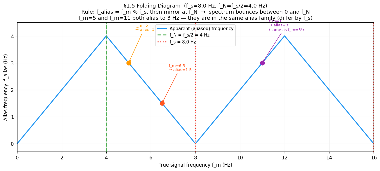
plt.show()61.6 The Folding Diagram¶
All aliases collapse into by a simple two-step rule:
Periodicity: — reduce to
Mirror: if , then — reflect at
This produces the triangular “folding” pattern:
Apparent frequency
    f_N |      /\      /\      /\
        |     /  \    /  \    /  \
        |    /    \  /    \  /    \
      0 |___/______\/______\/______\___
        0   f_N   f_s  3f_N  2f_s      True frequency
The spectrum bounces between 0 and with period .
Example ( Hz, Hz):
| True | Alias family member used | Note | |
|---|---|---|---|
| 2 Hz | 2 Hz | Below , no folding | |
| 5 Hz | : → | 3 Hz | Folds once |
| 6.5 Hz | : → 1.5 | 1.5 Hz | Folds once |
| 11 Hz | 3 Hz | Same alias as ! |
Hz and Hz are in the same alias family (they differ by exactly Hz). Both reconstruct as 3 Hz.
fs_fold = 8.0
f_N     = fs_fold / 2.0
f_range = np.linspace(0, 2 * fs_fold, 2000)

def apparent_frequency(f_true, f_s):
    """Two-step folding: mod then mirror at Nyquist."""
    f_N   = f_s / 2.0
    f_mod = f_true % f_s
    return np.where(f_mod <= f_N, f_mod, f_s - f_mod)

f_apparent = apparent_frequency(f_range, fs_fold)

plt.figure(figsize=(11, 5))
plt.plot(f_range, f_apparent, lw=2, label='Apparent (aliased) frequency')
plt.axvline(f_N,    linestyle='--', label=f'f_N = {f_N} Hz')
plt.axvline(fs_fold, linestyle=':', label=f'f_s = {fs_fold} Hz')

# Mark the three examples — f_m=5 and f_m=11 land at the same alias
for f_ex, f_al, note in [(5.0, 3.0, 'f_m=5→3'), (6.5, 1.5, 'f_m=6.5→1.5'), (11.0, 3.0, 'f_m=11→3')]:
    plt.scatter([f_ex], [f_al], zorder=5, s=80)
    plt.annotate(note, xy=(f_ex, f_al), xytext=(f_ex + 0.3, f_al + 1.0),
                 arrowprops=dict(arrowstyle='->'))

plt.xlabel('True frequency f_m (Hz)')
plt.ylabel('Alias frequency (Hz)')
plt.title(f'Folding diagram (f_s={fs_fold} Hz) — spectrum bounces between 0 and f_N')
plt.legend()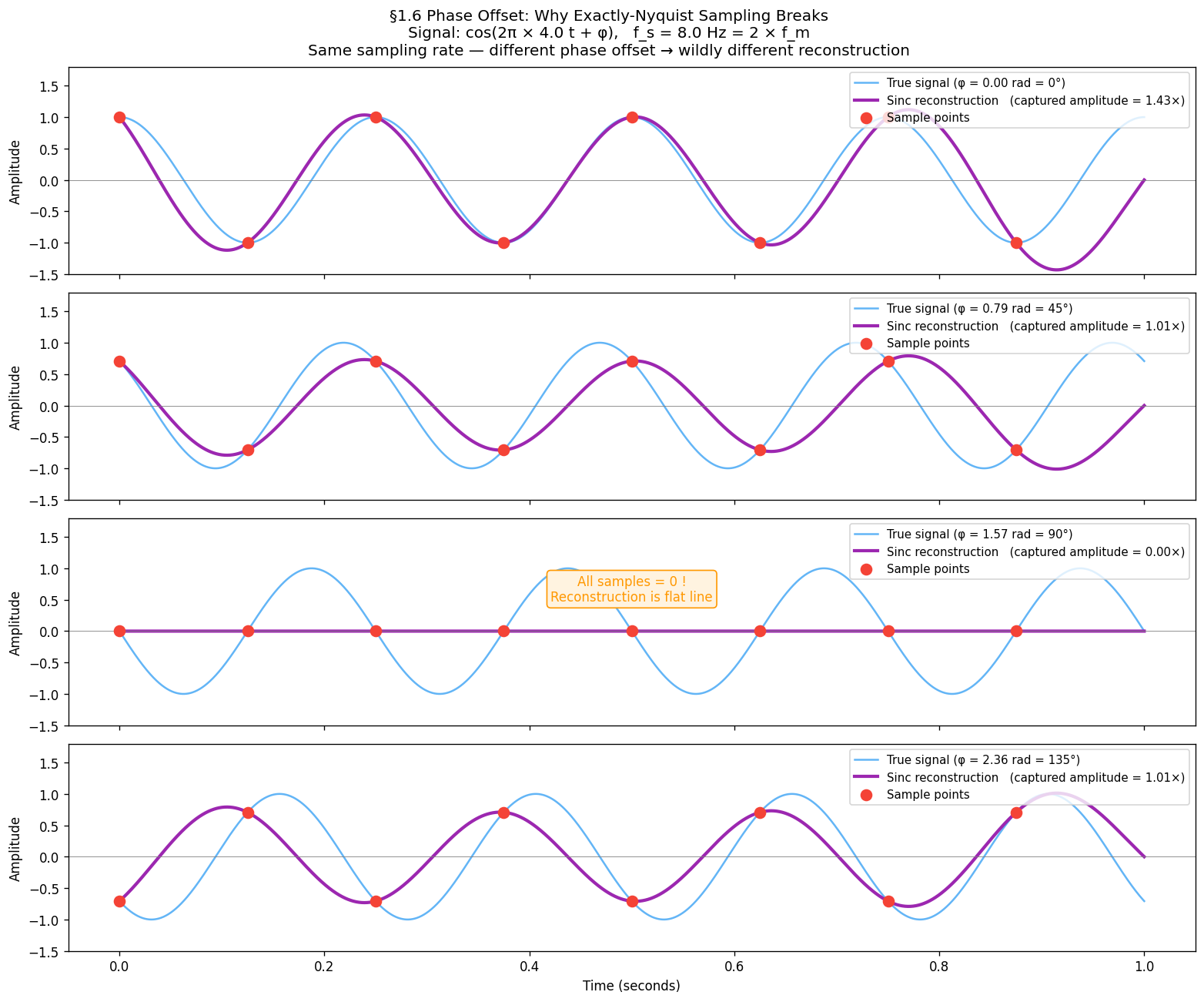
plt.show()71.7 Phase Offset — Why Exactly is Fragile — The Ideal Reconstructor¶
Given samples , the Whittaker–Shannon formula reconstructs the original signal:
where .
Each sample contributes a sinc “kernel” centred at its sample time. When , these kernels cancel perfectly everywhere the signal has no energy — giving exact reconstruction.
When , the reconstruction still runs — but it faithfully reconstructs the alias, not the true signal. The simulation makes this visible: a 5 Hz input emerges as 3 Hz output.
Phase offset — why exactly is fragile¶
The theorem says is sufficient — in theory. In practice the sampler and signal have independent clocks, so a phase offset can occur. At exactly the Nyquist rate:
: samples land on peaks and troughs → amplitude correctly captured
: samples land on every zero-crossing → all samples = 0 → reconstruction is a flat line
This is not a rare edge case — any arbitrary phase relationship between signal and sampler produces some amplitude error. Real systems therefore oversample () to make phase offset negligible.
f_phase = 4.0
fs_exact = 2 * f_phase # exactly at Nyquist = 8 Hz
t_ref = np.linspace(0, 1, 3000)
phase_offsets = [0, np.pi / 4, np.pi / 2, 3 * np.pi / 4]
fig, axes = plt.subplots(4, 1, figsize=(13, 11), sharex=True)
for ax, phi in zip(axes, phase_offsets):
true_sig = np.cos(2 * np.pi * f_phase * t_ref + phi)
t_s = np.arange(0, 1, 1.0 / fs_exact)
s_s = np.cos(2 * np.pi * f_phase * t_s + phi)
recon = sum(sn * np.sinc(fs_exact * (t_ref - tn)) for tn, sn in zip(t_s, s_s))
captured_amplitude = np.max(np.abs(recon))
ax.plot(t_ref, true_sig, alpha=0.6, label=f'True signal (φ={np.degrees(phi):.0f}°)')
ax.plot(t_ref, recon, lw=2.5, label=f'Reconstruction (amplitude={captured_amplitude:.3f})')
ax.scatter(t_s, s_s, s=70, zorder=5)
ax.legend(loc='upper right', fontsize=9); ax.set_ylabel('Amplitude')
axes[-1].set_xlabel('Time (s)')
plt.suptitle('Phase offset at exactly Nyquist rate — φ=90° collapses reconstruction to zero', fontsize=12)
plt.tight_layout()
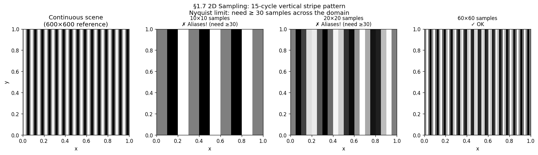
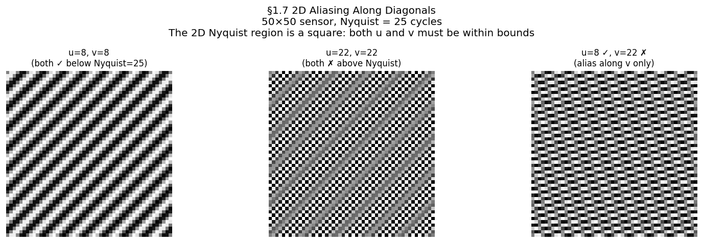
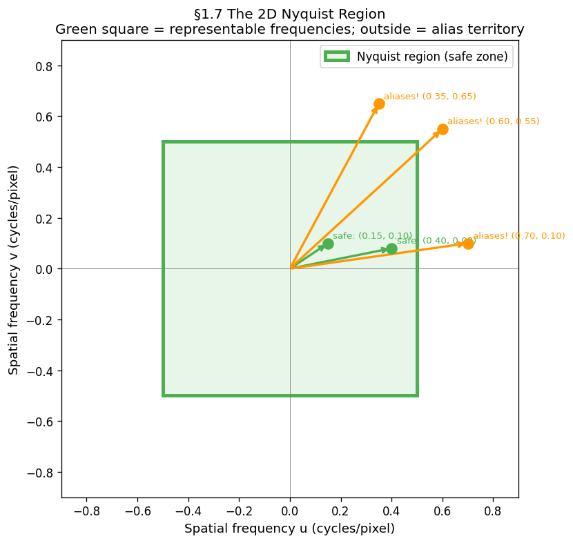
plt.show()81.8 From 1D to 2D — The Nyquist Square¶
An image is a 2D signal . The Nyquist criterion applies independently along each axis:
Along (columns): need
Along (rows): need
A 2D sinusoidal pattern has a frequency vector in cycles/pixel. The safe zone is the Nyquist square in 2D frequency space:
Any outside this square aliases. The direction depends on which axis is violated:
| Violation | Artefact |
|---|---|
| only | False horizontal stripes |
| only | False vertical stripes |
| Both violated | Moiré — diagonal phantom pattern |
A square sensor with pixels has cycles per image. Any scene pattern with more than cycles across the image will alias.

# ── 2D stripe: same 15-cycle pattern at three sensor resolutions ──────────
u_pattern = 15   # cycles across the unit square
HIGH_RES  = 600
x_c = np.linspace(0, 1, HIGH_RES)
XX_c, _ = np.meshgrid(x_c, x_c)
continuous_2d = np.sin(2 * np.pi * u_pattern * XX_c)

fig, axes = plt.subplots(1, 4, figsize=(15, 4))
axes[0].imshow(continuous_2d, cmap='gray'); axes[0].set_title('Continuous scene')
for ax, N in zip(axes[1:], [10, 20, 60]):
    x_s = np.linspace(0, 1, N)
    XX_s, _ = np.meshgrid(x_s, x_s)
    sampled = np.sin(2 * np.pi * u_pattern * XX_s)
    status = '✓ OK' if N >= 2 * u_pattern else '✗ Aliases!'
    ax.imshow(sampled, cmap='gray', interpolation='nearest')
    ax.set_title(f'{N}×{N} — {status}')
plt.show()

# ── 2D aliasing sweep: fix sensor at 40×40, vary pattern frequency ────────
SENSOR_N = 40
x_s = np.linspace(0, 1, SENSOR_N)
XX_s, _ = np.meshgrid(x_s, x_s)
fig, axes = plt.subplots(1, 5, figsize=(16, 3))
for ax, u in zip(axes, [4, 10, 18, 30, 38]):
    ax.imshow(np.sin(2 * np.pi * u * XX_s), cmap='gray', interpolation='nearest')
    ax.set_title(f'u={u} {"✓" if u <= SENSOR_N//2 else "✗ alias"}', fontsize=9)
    ax.axis('off')
plt.show()

# ── Diagonal aliasing ─────────────────────────────────────────────────────
SENSOR_D = 50
x_d = np.linspace(0, 1, SENSOR_D)
XX_d, YY_d = np.meshgrid(x_d, x_d)
cases = [(8, 8, 'u=8,v=8 ✓'), (22, 22, 'u=22,v=22 ✗'), (8, 22, 'u=8✓ v=22✗')]
fig, axes = plt.subplots(1, 3, figsize=(13, 4))
for ax, (u, v, title) in zip(axes, cases):
    ax.imshow(np.sin(2 * np.pi * (u * XX_d + v * YY_d)), cmap='gray', interpolation='nearest')
    ax.set_title(title); ax.axis('off')
plt.show()

# ── Nyquist square diagram ────────────────────────────────────────────────
f_N_2d = 0.5
fig, ax = plt.subplots(figsize=(6, 6))
ax.add_patch(plt.Rectangle((-f_N_2d, -f_N_2d), 2*f_N_2d, 2*f_N_2d,
             linewidth=3, edgecolor='green', facecolor='#E8F5E9', label='Nyquist region'))
for u, v, safe, label in [(0.15, 0.10, True, 'safe'), (0.70, 0.10, False, 'aliases!'),
                           (0.35, 0.65, False, 'aliases!')]:
    color = 'green' if safe else 'orange'
    ax.annotate('', xy=(u, v), xytext=(0, 0), arrowprops=dict(arrowstyle='->', color=color, lw=2))
    ax.text(u+0.02, v+0.02, label, fontsize=9, color=color)
ax.set(xlim=(-0.9, 0.9), ylim=(-0.9, 0.9), aspect='equal',
       xlabel='u (cycles/pixel)', ylabel='v (cycles/pixel)',
       title='2D Nyquist region — green square is the safe zone')
ax.legend()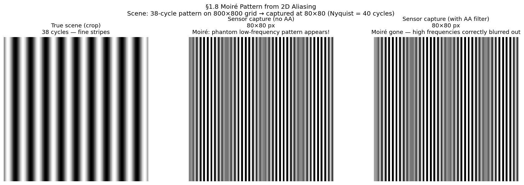
plt.show()91.9 Moiré — 2D Aliasing in Practice¶
Moiré is what aliasing looks like in a photograph. When a fine periodic texture — fabric weave, window mesh, brick mortar, PCB traces — is photographed at insufficient resolution, its high spatial frequency aliases to a coarser phantom pattern. The phantom is not in the scene; it is created by the sampling process.
Construction:
True scene: where
After sampling at : samples identical to
Reconstructed image shows cycles — a slower, longer-wavelength pattern
Prevention: apply a low-pass filter (optical or digital) before sampling, removing all content above . Camera manufacturers place an Optical Low-Pass Filter (OLPF) directly in front of the sensor array. In software, this is a Gaussian or Lanczos blur before any downsampling operation.
from scipy.ndimage import gaussian_filter

SCENE_SIZE  = 800
SENSOR_SIZE = 80
f_high      = 38    # above Nyquist (= 40)

x_scene = np.linspace(0, 1, SCENE_SIZE)
XX_scene, _ = np.meshgrid(x_scene, x_scene)
scene_pattern = np.sin(2 * np.pi * f_high * XX_scene)

step = SCENE_SIZE // SENSOR_SIZE
# Without AA — naive downsample, alias appears
aliased_image = scene_pattern[::step, ::step]

# With AA — Gaussian blur before downsample removes content above Nyquist
sigma = step / (2 * np.pi)
antialiased_img = gaussian_filter(scene_pattern, sigma=sigma)[::step, ::step]

fig, axes = plt.subplots(1, 3, figsize=(15, 5))
axes[0].imshow(scene_pattern[:200, :200], cmap='gray'); axes[0].set_title('True scene (crop)')
axes[1].imshow(aliased_image, cmap='gray'); axes[1].set_title('No AA filter — moiré appears!')
axes[2].imshow(antialiased_img, cmap='gray'); axes[2].set_title('With AA filter — moiré gone')
for ax in axes: ax.axis('off')
plt.show()
Run all simulations:
uv run python tutorials/00_introduction_to_digital_images/part1_digitisation.pyFigures save tobook/figures/.
10Summary¶
| Concept | Statement |
|---|---|
| Sampling | Measuring a continuous signal at |
| Highest frequency in the signal | |
| Nyquist frequency — ceiling set by your hardware | |
| Nyquist rate | Minimum for lossless reconstruction |
| Alias family | — all produce identical samples |
| Folding | Frequencies above mirror back into |
| Sinc reconstruction | Exact when ; outputs alias otherwise |
| Phase fragility | At exactly , a offset destroys the signal |
| 2D Nyquist | Applies per axis; violation → moiré |
| Prevention | Low-pass filter before sampling (OLPF / Gaussian blur) |
11Exercises¶
Hz. List the first three alias family members of Hz.
A sensor has 640 pixels across a 100 mm field. What is in cycles/mm? What is the smallest detectable feature?
Why does the moiré pattern in a photograph of a fine mesh move when you zoom the image in a browser?
Next → Chapter 2 — The Sensor: now that we know what sampling means, what does the hardware physically do at each sample point?